
Matt Connors: Finding Aid review – fearless exhibition full of unexpected pleasures
Seeing as we’re here, I think I’ll go for the English breakfast. Or maybe the keftedes – or even the grilled “shieftalia”. Hmm. How about “Mini hot-dog and french fires”? Or jacket potato with “bolognaise sause and cheeese”? Decisions, decisions. Hang on a minute. The menu – in red and blue on a white background – is a perfect full-scale copy, including the original mis-spellings, of the tourist menu on display at the Ideal Café in Paphos, Cyprus, repainted by Cypriot artist Christodoulos Panayiotou. Presented outside one of the galleries at Goldsmiths CCA, as part of Matt Connors’ exhibition Finding Aid, the menu wrong-foots the hungry viewer. The American painter includes 21 other artists in his largest exhibition in the UK to date. As much as he is giving us context, the artist sets out to enlist and co-opt, to enlarge, confuse and divert.
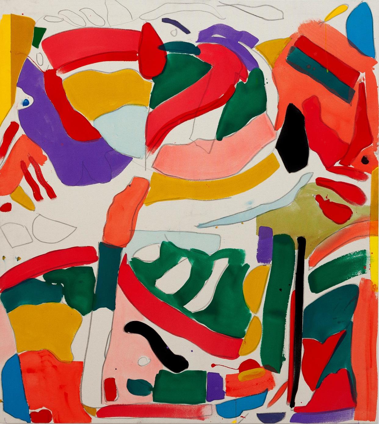
Artists frequently make fascinating curators, bringing their sensibilities to bear on their choices and affinities. Do not expect art historical rectitude or the obvious to guide their thinking. Connors’ choices are eclectic, heterogenous and unexpected, just like his own art, with its cheery stripes and arcs, his squiggles and tadpoles of thinly painted colour, his amateur-hour Rothko riffs, his modernist mash-ups of the geometric and the informal. Connors’ paintings can sometimes look like the sort of jaunty inoffensive abstracts you see decorating hospital walls, or painted by-the-yard hotel-room decor. He is unafraid of the decorative and the apparently slight.
Translucent hangings of clear acrylic resin trap frayed wafts of plastic mesh, bursts of colour and snarls and bogeys of dried resin in their agglutinated surfaces, in a couple of works by American artist Suzanne Jackson. Like flotsam from the great garbage patch of plastic refuse that drifts on the Pacific currents, Jackson’s works float in the air, catching the breeze.
Mid-1960s drawings on paper by Patrick Procktor, a contemporary of David Hockney, depict leather garments and queer boys in leather, drawn just a year or two before the decriminalisation of homosexuality in the UK. A red ceramic handkerchief, with a pattern of little white spots, drapes over a small canvas by Siobhan Liddell. If the hanky is a trompe l’oeil gag about illusionism, it is also a sign to the initiated, flagging a code of queer desire. A coloured hanky flaunted in the pocket can have all kinds of errant symbolism if you are in the know. And here’s French artist Guy de Cointet’s lovely, loopy mirror writing, whose calligraphic lines have to be read backwards. “What? I can’t hear a thing!” reads one.
Connors’ own paintings are also full of mirrorings, reversals, surreptitious associations and signposted misdirections. Avoiding the aura of the serious, Connors sometimes achieves it anyway. The colour is punchy though the paint is thin. Among their blips, blobs and planes of flat colour, enlivened by little incidents and accidents, their visual quotations and mis-rememberings begin to add up, and a pattern slowly emerges.
Dozens of shards of glazed pottery, by English art-deco ceramicist Clarice Cliff, are displayed on a table. These broken fragments were dredged up from a slag-heap that had built up beside the river in Stoke on Trent, directly beneath the windows of the old AJ Wilkinson Royal Staffordshire Pottery, from which the shards were thrown during Cliff’s time working there. Connors bought this collection of shards at auction, and has produced an illustrated book of them. Connors’ painting Cliff is also based on these “accidentally abbreviated forms”, a few of which have also migrated on to the shelves of several fanciful little cabinets by Ryan Preciado, which dot the show. Elsewhere, Connors has taken from one of Robert Cummings’ staged photographs of dangling tangles of cables that purport to show part of a particle accelerator at the Massachusetts Institute of Technology (Cummings’ photographs are never quite what they seem) as the basis of another painting.
You begin to see the choices Connors has made in his curating as commentaries on his own art. Finding a big, almost blank canvas by the late British artist Bob Law here is one of the show’s many surprises. A single fat black line describes a wonky parallelogram just inside the painting’s edge, as if a farmer were walking the boundaries of one of his fields. Law made numerous drawings of fields when he lived in Cornwall, as a sort of a conceptual response to both landscape and the work of the St Ives school of painters. Then he pared things down: his 1969 canvas is itself both landscape and drawing, a demarcation of mental and physical territory.
Connors’ paintings often do that too. It is easy to see what drew Connors to Miyoko Ito (1918-83), whose close-toned, quiet painting is filled with intersecting overlays of forms that fold and flow like patterned fabric over a body. This too could also be a landscape. Ito was a member of a group of Chicago artists who called themselves Allusive Abstractionists, and only recently has her work begun to be re-examined. Connors has been instrumental in making her work better known.
Finding Aid is full of such unexpected pleasures. There are no wall labels, and only a somewhat confusing exhibition guide, with numbered plans of each of the five galleries, to work out what exactly it is you are looking at. Nothing exists in a vacuum, and all art needs context. Without it you wouldn’t know what you were looking at, or even know whether it was art at all. It could just be lunch.
• Finding Aid is at Goldsmiths CCA, London, until 2 June

